Is There Something Wrong With This Picture?
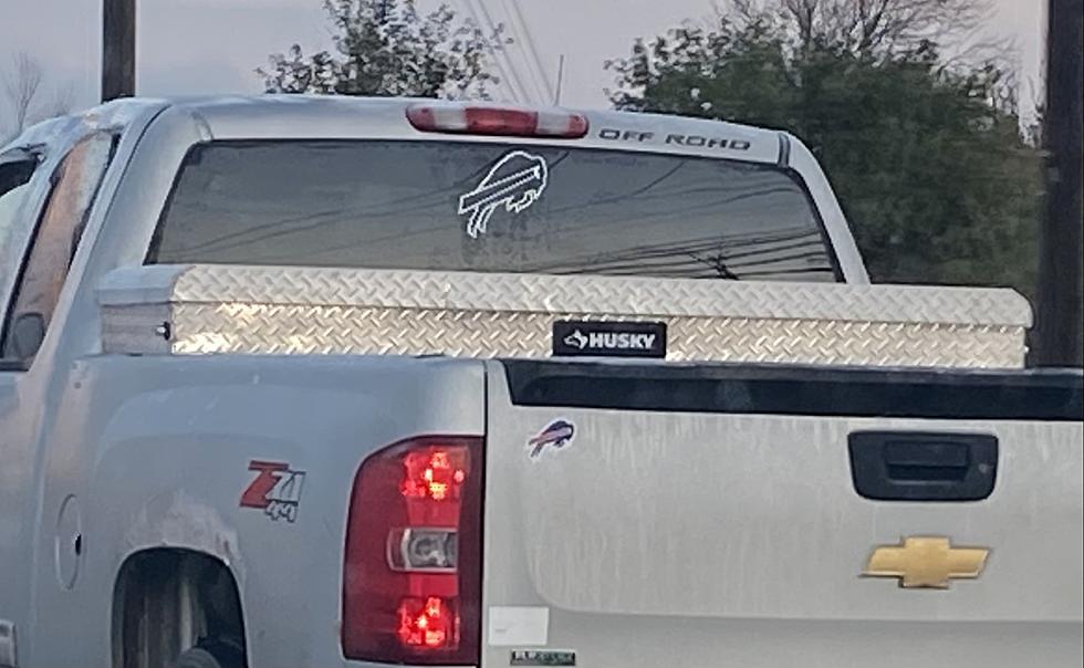
Take a look at the picture above. There might be something that stands out to you and I'm honestly asking...is there anything wrong with it?
I've seen this multiple times over the last couple of weeks. People have a renewed love for the Bills. They look good, and people are back on the bandwagon. But that also means that we're seeing their logo a lot more often. The question is...
How do you display the logo?
I've done what the guy in the picture above did. If you look at it, it's not displayed the way it normally is. Normally the flag on the logo is more horizontal. But this one looks like it's angled up. And if you look at the logo, it almost looks like it should be that way.
Most of the merchandise that you get will show the flag on the buffalo looking horizontal. So is that the right way to display it?
Look At The Helmets To Decide
I mentioned that to someone and they brought up the fact that the way it looks on the new white helmets, it's actually angled up.
It doesn't look like it did that as much on the red helmet.
Is It Jumping? Or Charging?
If you really look at the logo, it almost looks like it's jumping over something. With the logo angled up (like it is on the truck above) the head is looking forward. If the logo is horizontal it looks like it's got its head down. Either way it makes sense. I'd imagine they lead with their horns when they're charging.
So what do you think? What's the right way to angle the logo when you're displaying it?
8 Awesome Amazon Finds For The Bills Fan's Garden
Gallery Credit: WYRK
8 Awesome Amazon Finds For The Bills Fan's Garden
Gallery Credit: WYRK
Every Pick Made By Buffalo Bills GM Brandon Beane
Gallery Credit: Brett Alan
The Winningest Head Coaches In Buffalo Bills History
More From 106.5 WYRK


